Talk to Maple
Role
Product · UX/UI · Front-End Dev
Team
3 Co-Founders
Duration
8 Weeks
Tools
Flutterflow · Xano · Firebase
Overview
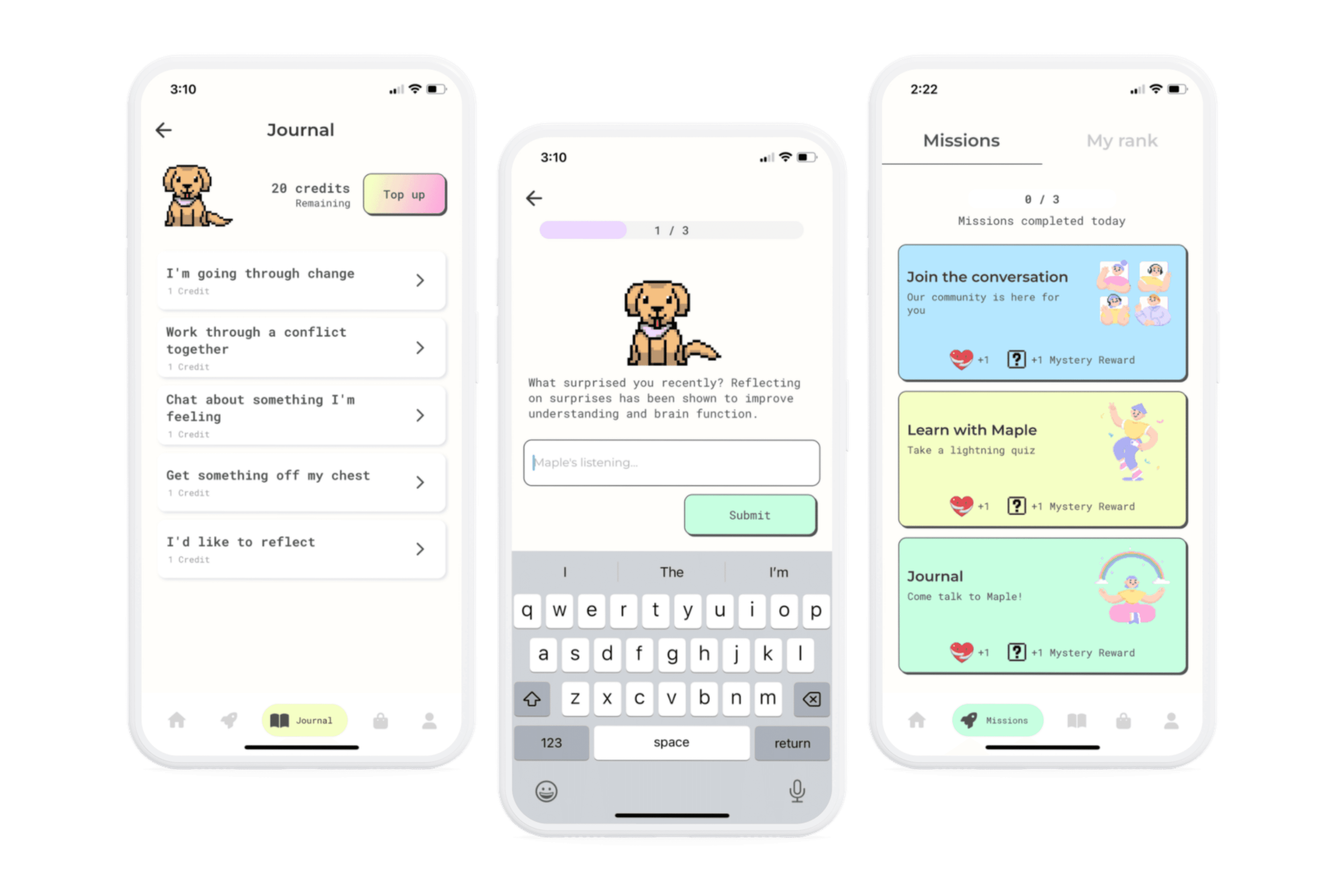
Talk to Maple is a startup founded by myself and 2 other co-founders, with our idea being accepted into Antler's VC pre-launch program in January 2023. This program offers promising founders the opportunity to build their companies and raise $200K in pre-seed funding. As a co-founding team we built and launched a B2C app helping young people improve their mental health through building better self care habits, via the power of A.I. journaling and gamification.
The Challenge
Make journaling an engaging experience
Journaling is widely accepted as a best practice tool to support mental health, however from our own experiences we've seen that many people simply don't do it. So we went on a mission to create a morefun and engaging experience, particularly for Gen-Z, the generation most in need of mental health support (with 1 in 5 impacted worldwide annually).
I led product, design and front-end development and the other full time co-founder led go-to-market, commercials and back-end development. The third co-founder was part time (1-2 days a week), supporting the A.I. integration, prompt engineering and data science.
The Goal
Our goal was to launch an app that included a journalling experience that users enjoyed and they wanted to keep coming back to (demand and engagement). We also wanted to prove that our journaling experience had a positive impact on the user, and that no harm was done.
Scope and Constraints
There were a number of constraints around this project. Being a VC program, we had an extremely short timeline with milestones we had to hit throughout to progress to the next phase. This meant at times we were making trade-offs between user needs and potential investor expectations.
We also had no coding experience, so we decided to launch our app using a low-code platform. There was a steep learning curve and limitations to what we could achieve that had to be factored into the product and design decisions.
We additionally had extremely limited budget, with any expense being out of pocket. Given this, we weren't able to outsource aspects of the project and ultimately kept costs low by doing / learning everything ourselves.
Discover
Understanding the problem
I began discovery by outlining the key goals we had for this phase. In particular I wanted to understand:
- What currently works for young people when needing mental health support
- The competitive landscape including common design themes and any gaps in the market
- What others are saying around this issue online and elsewhere (mental health forums etc.)
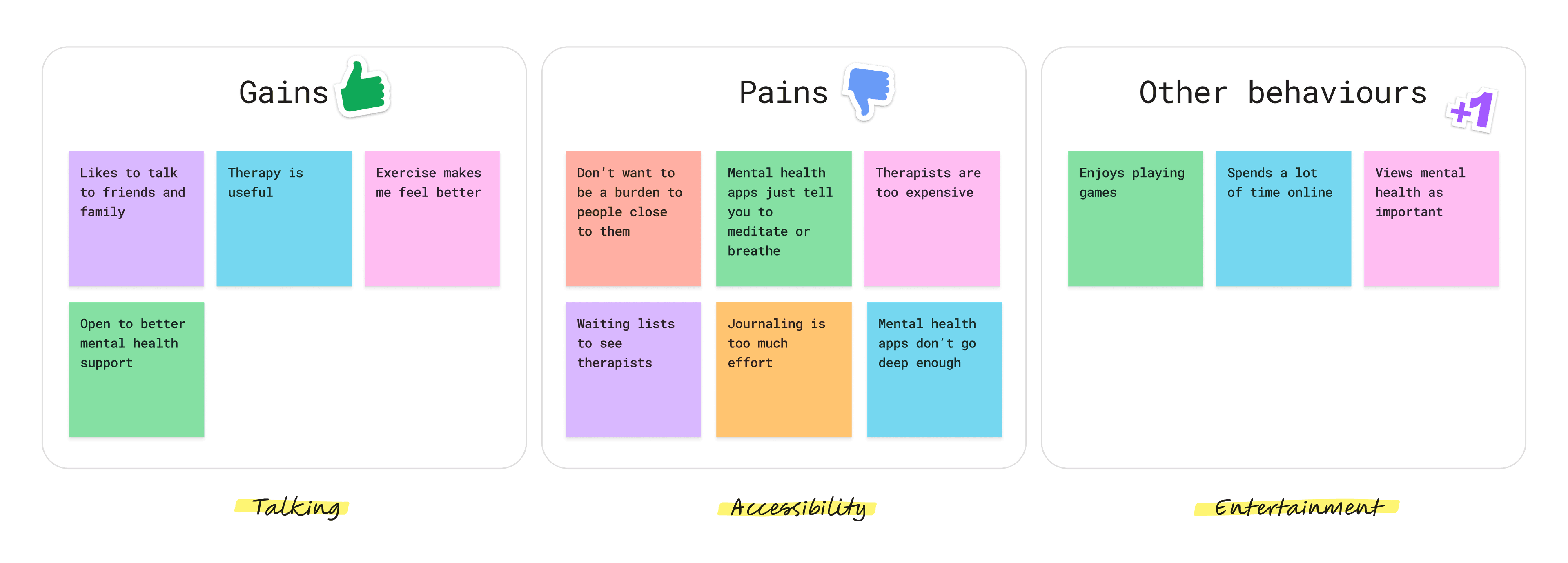
We conducted user interviews and ran surveys targeting young people impacted by mental health to learn more. These activities helped us uncover some key insights:
- Gen-Z care about supporting their mental health, and are happy to try new things to do so
- Talking was the most impactful activity that anecdotally helped when in need of support
- Mental health support doesn't feel easilyaccessible
- People don't always want to 'burden' people close to them with their issues
- Gen-Z want to be entertained

Researching the Competitors
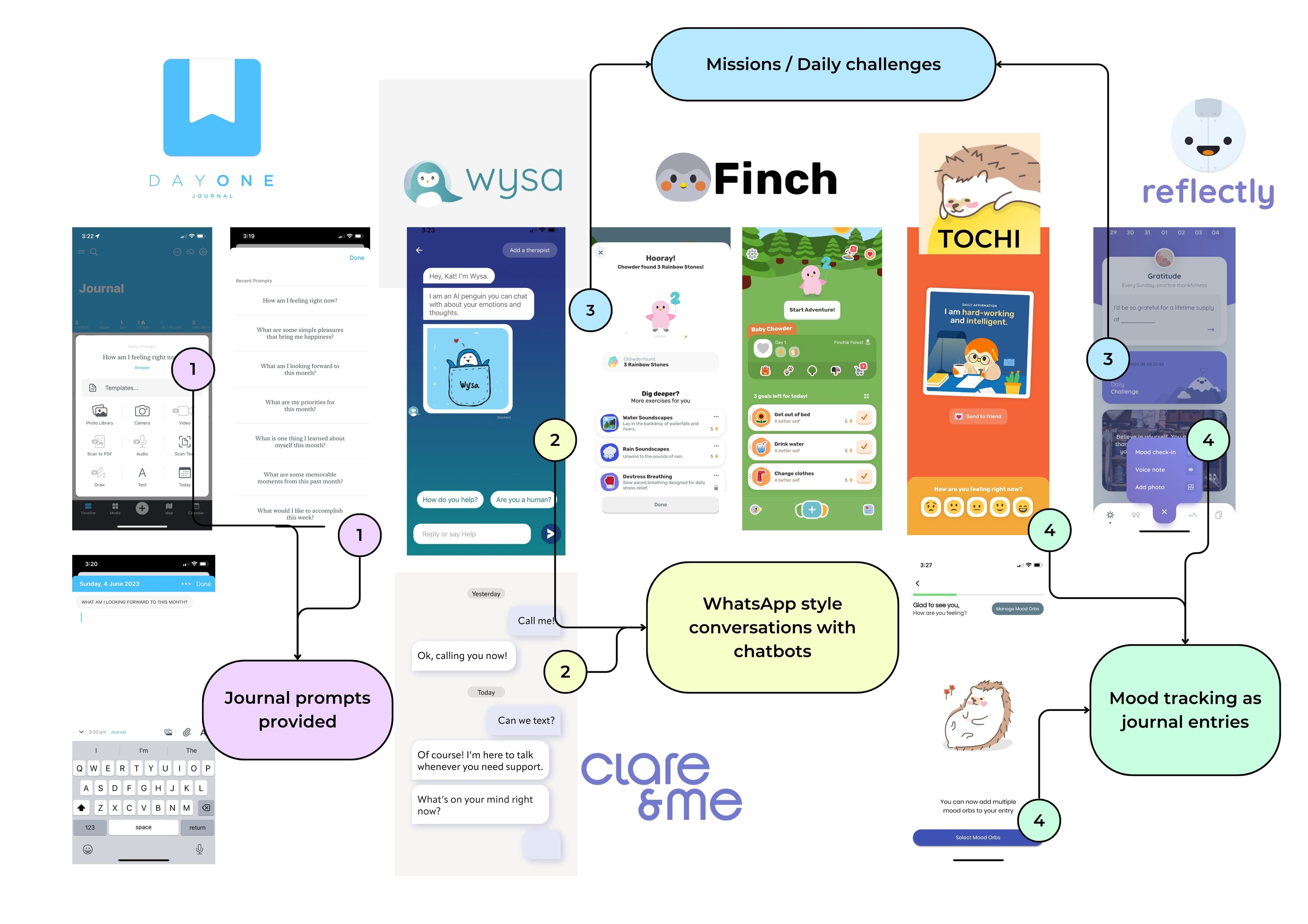
For competitive analysis, I focussed on top-rated journaling apps, entertainment based mental health support apps (e.g. chatbots), mood trackers and digital self care companion apps.
This helped me identify common design patterns we can utilise and take inspiration from, as these will already be familiar to our users and will reduce friction and cognitive load. These included:
- Pre-set journal prompts, providing some guidance and direction for the user to get started
- A daily challenge or mission (+ rewards) to encourage users to return
- Utilising a WhatsApp style of messaging with chatbots, an easily recognisable and known format for users
The analysis also helped me identify some promising opportunities for us to improve on the experience for users as well:
- Lack of A.I. - most mental health chatbots weren't powered by A.I., meaning the conversations were limited and it was pretty easy for a user to 'break' the experience by talking about something left of field.
- Formal tone - The limited few that were powered by A.I. were very formal, lacked personality and felt forced or 'fake'. It was very obvious it wasn't a real person you were speaking to.
- Surface level - A number of apps claiming they supported journaling, actually only offered basic mood tracking features where the user is able to add their mood and then write a brief note about it. This doesn't go very deep and is unlikely to offer any significant benefits.
Define
Defining the scope of the MVP
To solve the problem at hand, we identified several key elements:
- Mobile App
Given our target market of Gen-Z, we wanted to offer something easily accessible to as many people as possible. With most people worldwide having a mobile in their pocket, a mobile application was the best way for us to do this. - A.I. Powered Journaling
We wanted to go beyond simple mood check-ins and provide an engaging experience. By leveraging AI and carefully crafting prompts, we believed we could achieve a fun and exciting journaling experience, while maintaining a conversational tone. - WhatsApp Conversational Style
Given the familiarity and popularity of the WhatsApp design style for conversations, we chose to adopt a similar interface for our mobile-based AI conversations. - Gamification
Understanding that Gen-Z seeks entertainment, we decided to differentiate our app by gamifying the mental health experience. We aimed to create a Duolingo-like experience, as gamification not only promotes user retention but also helps establish long-term habits. - Digital Companion
We observed the success and positive user feedback of mental health applications incorporating digital companions. We saw an opportunity to incorporate a self-care buddy into our app, which would guide our prompt engineering and provide a thematic structure for gamification elements such as items and missions.
Despite our tight 4-week timeline for the first milestone, we believed we could achieve these features and demonstrate two crucial factors to potential investors. Firstly, our ability to build and launch a mobile application without a dedicated developer. Secondly this would provide enough end-to-end functionality for us to generate some meaningful user data to gauge early signals of usage and demand.
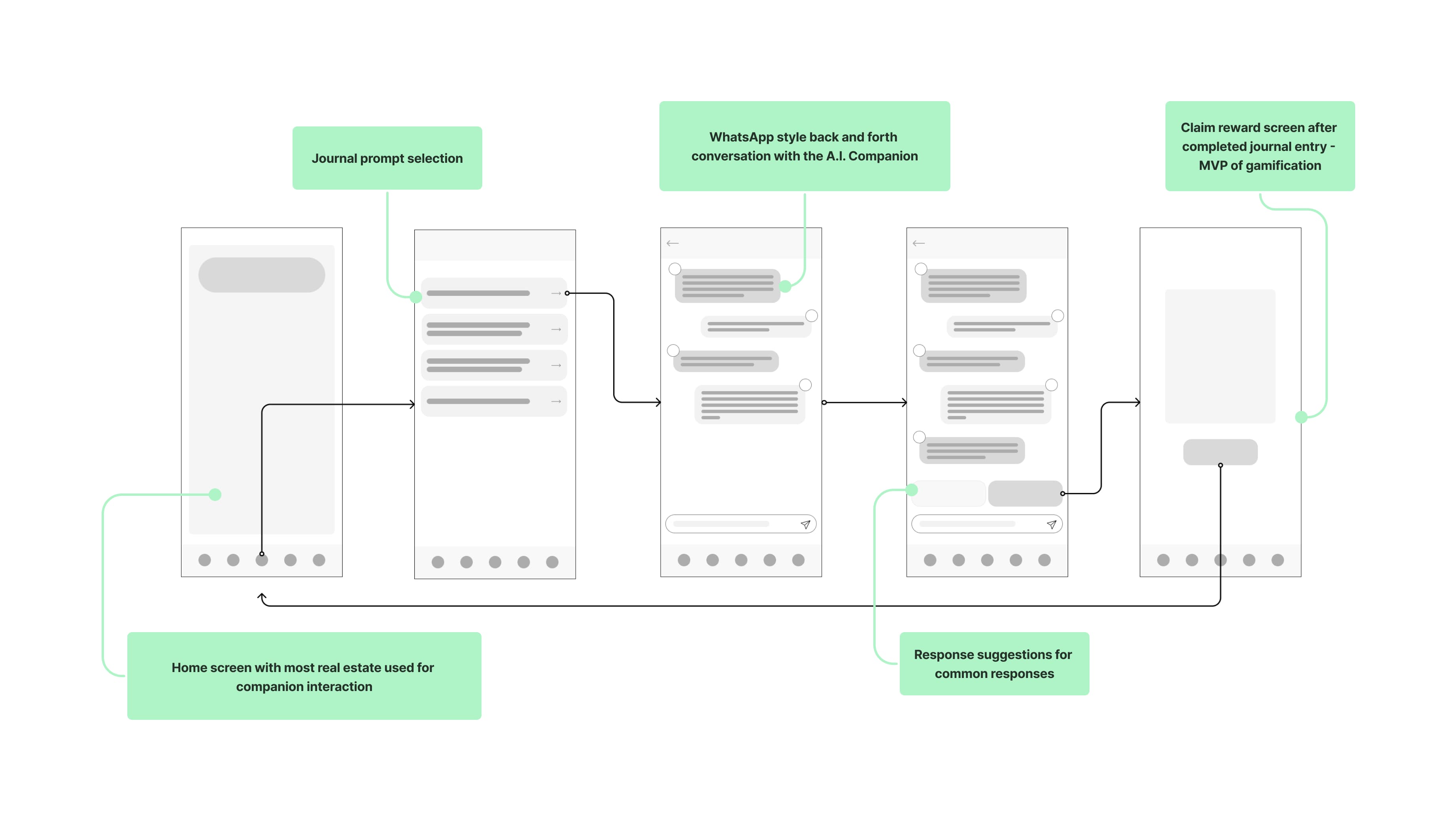
I put together some basic wireframes to better visualise the direction of the solution given the above:
Iterate
Setbacks, reflection and revising our approach
When we delved into building the WhatsApp conversational style feature, we hit a roadblock. We realised Flutterflow's messaging didn't support calling third-party APIs (e.g. OpenAI) and displaying the response. In order to do that we were going to need to write some custom code, which was outside of our capabilities.
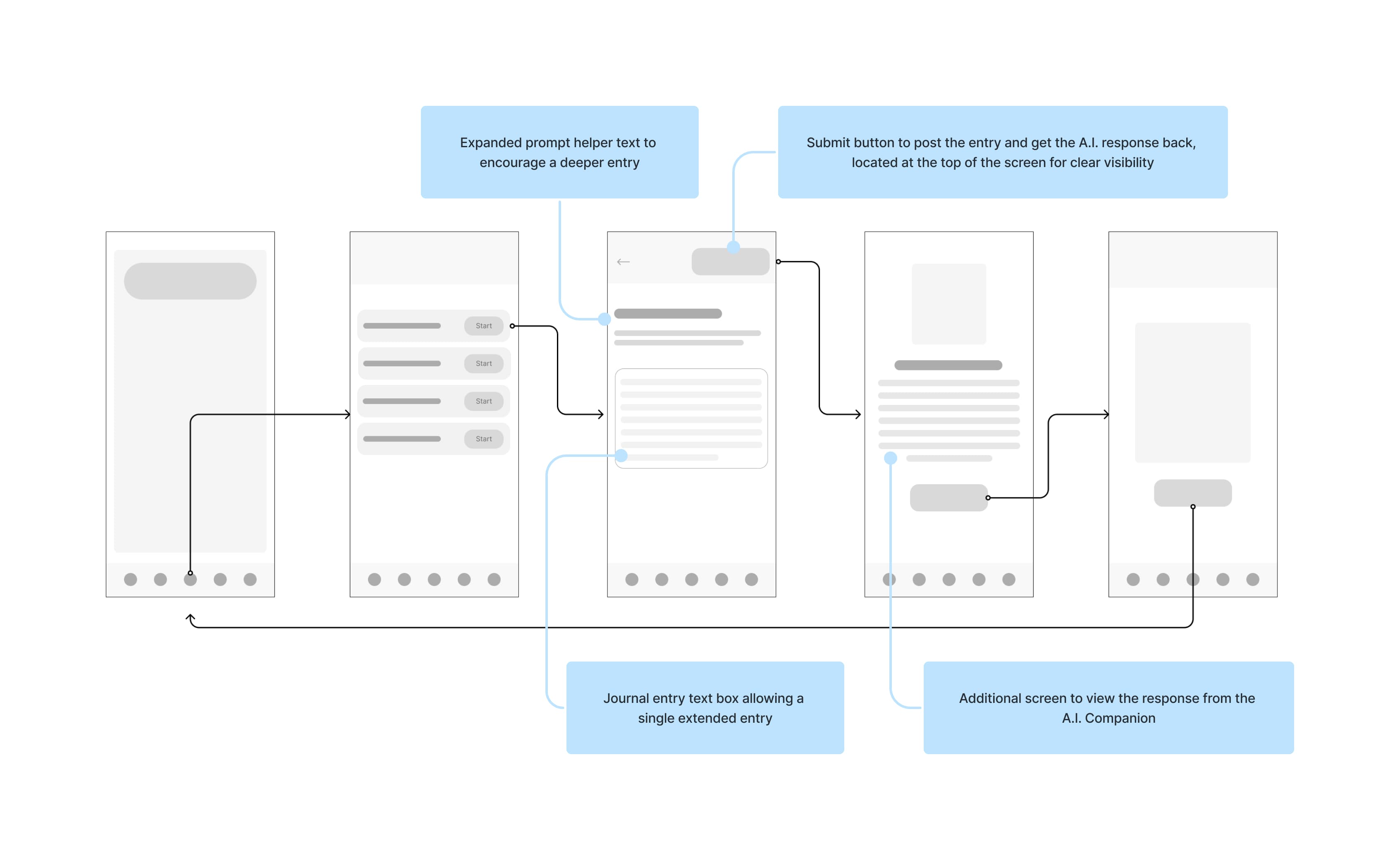
Initially this felt like a major setback; the whole premise of our app seemed to go down the drain without the conversational style journaling. Soon afterwards I was using Duolingo and had alightbulb moment. They had this brilliant way of structuring lessons: one question per page, and you had to hit "submit" to move on. It kept you laser-focused on the task at hand and made everything feel doable, without overwhelming you with a wall of text.
That got me thinking; what if we applied a similar approach to journaling? A step-by-step process, one page at a time. From a technical standpoint, we could handle the API response upon submission, and that solved our earlier woes. Plus, I had a hunch that it would actually provide a better experience for our users. More focus, bite-sized "missions," and less effort to complete a journal entry (which we discovered as a pain point in our user research).
I put together some wireframes to outline this revised direction:
Integrating the A.I
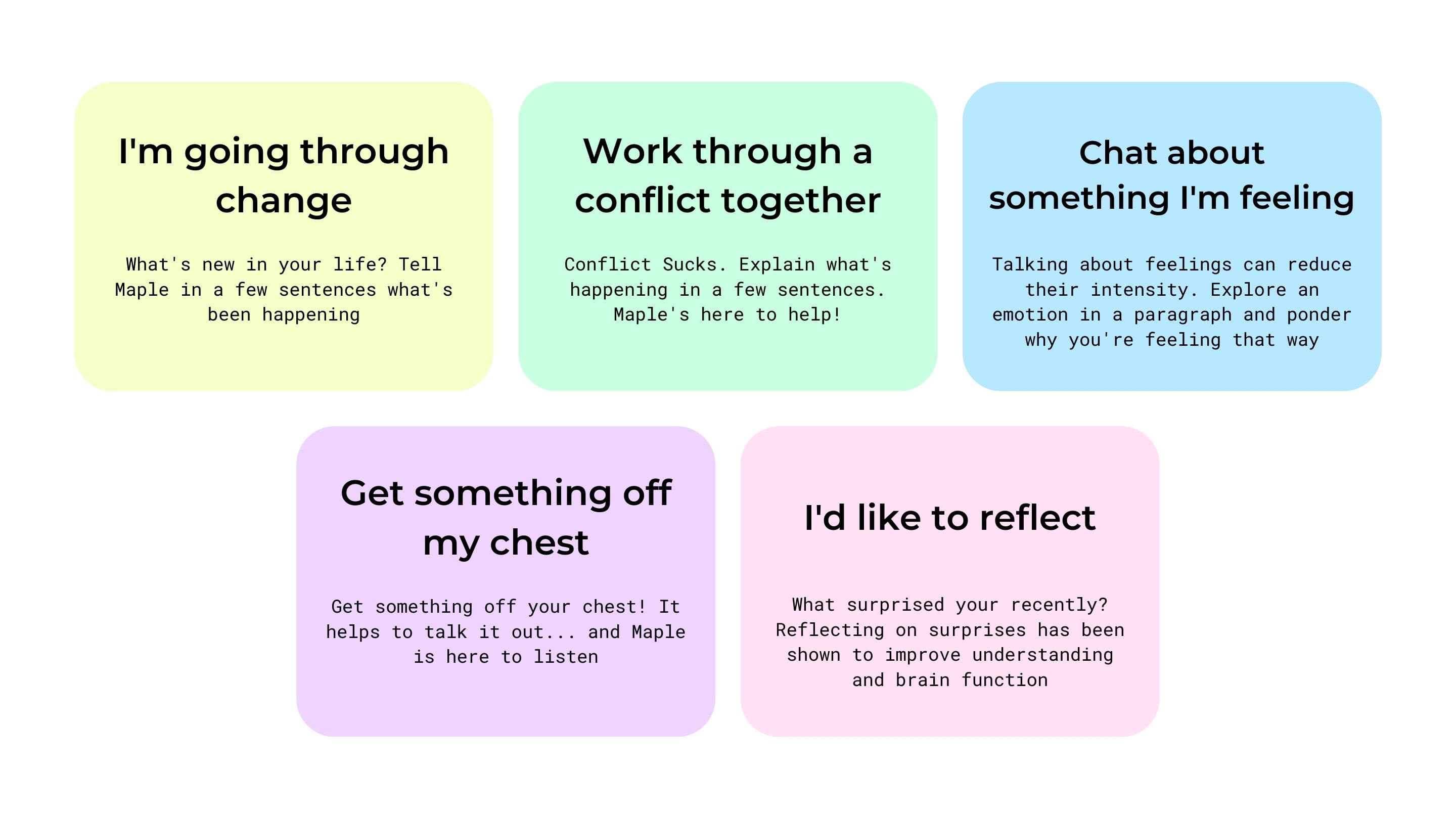
While integrating ChatGPT into our application, we considered the prompts and AI responses. Initially, we identified potential journal prompt areas based on our research. To validate and refine these prompts, we sought feedback from mental health professionals. After careful consideration, we settled on an initial set of prompts:
To gauge user engagement with the AI, we also conducted an experiment involving mental health professionals and users. The AI was hosted in a web browser, and we provided pre-set prompts from the perspective of our chosen digital companion; a puppy named Maple.
From the experiment, we observed that users tended to disengage after approximately 4-5 exchanges. The key contributor being the AI's repetitive nature and excessive focus on asking "Why" repeatedly. This reinforced the decision to pursue a staged journaling approach instead of the WhatsApp conversational style. It also provided insights for improving our prompt engineering.
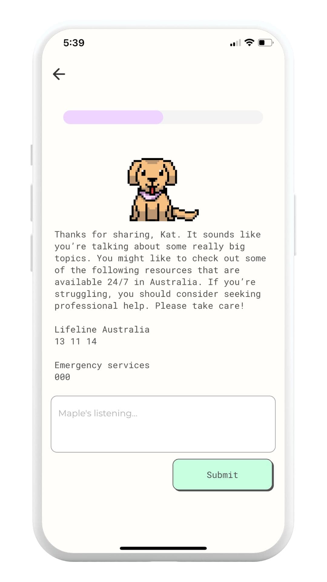
Additionally, mental health professionals emphasised the importance of incorporating a red flag check. They stressed that if a user expresses self-harm or engages in extremely sensitive or harmful discussion, the AI needs to be able to recognise its limitations and provide appropriate resources.
Introducing a 'red flag' check
Ensuring ethical practices and prioritising the well-being of our users were key considerations throughout this process. To address this, we implemented a "red flag" system that allowed the AI to respond appropriately when users discussed serious issues like suicide and self-harm. In such cases we wanted to stop the conversation from going further and serve the user with some helpful resources for seeking help.
Initially, we attempted to create our own capture system based on keywords, but we discovered that some instances slipped through undetected. Fortunately, OpenAI soon introduced their own auto-moderation feature, which captured most instances of concern. However, through QA testing we found there were still a few cases that went unnoticed.
As a result, we decided on a combination approach. We utilised OpenAI's auto-moderation system alongside our dedicated keyword capture. This proved more effective and allowed us to continually build on the keyword list to address any potentially missed cases in the future. By combining these approaches, we were able to better ensure user safety while maintaining control over the moderation process.
Develop
Launching the MVP
We spent 3 weeks defining, designing, building and launching the MVP of our app. Once deployed to the app stores we ran some targeted facebook ads to attract our first cohort of users and begin getting some real customer feedback.
We had positive early signals, with a low Cost Per Click (CPC), showing that our ad was effective, and we gained85 users in the first week of our MVP being live (users in this scenario = people that downloaded, opened and completed at least 1 journaling session within the app).
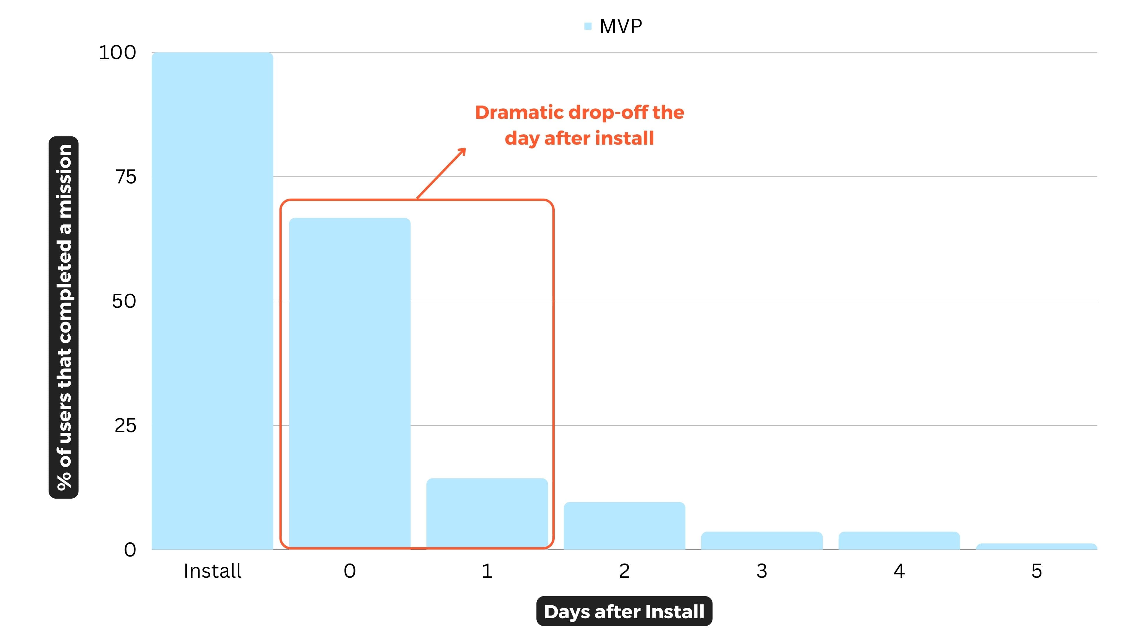
We had achieved our initial goal of launching an app, and proved that our value prop did convert and we could get users to download and use the app. There was interest! We next sought to focus on improving retention and engagement, as we saw a steep decline in usage after day 1.
Managing Open A.I outages... lots of them
During the initial days of our MVP launch, ChatGPT experienced frequent outages and errors. Users were often affected, receiving confusing error messages that deterred them from returning to the app. This created an overall poor user experience.
To address this issue, we added a fallback mechanism with a hardcoded message that aligned with the brand and companion. This approach seemed to have a positive impact on user retention; the inclusion of a message from the companion saying "I'm just having a nap, puppies need their beauty sleep. Come back soon!" actually encouraged 2 users to return to the app the following day asking Maple the companion "Are you awake yet?". 🐶
Iterate
Valuable learnings from the MVP
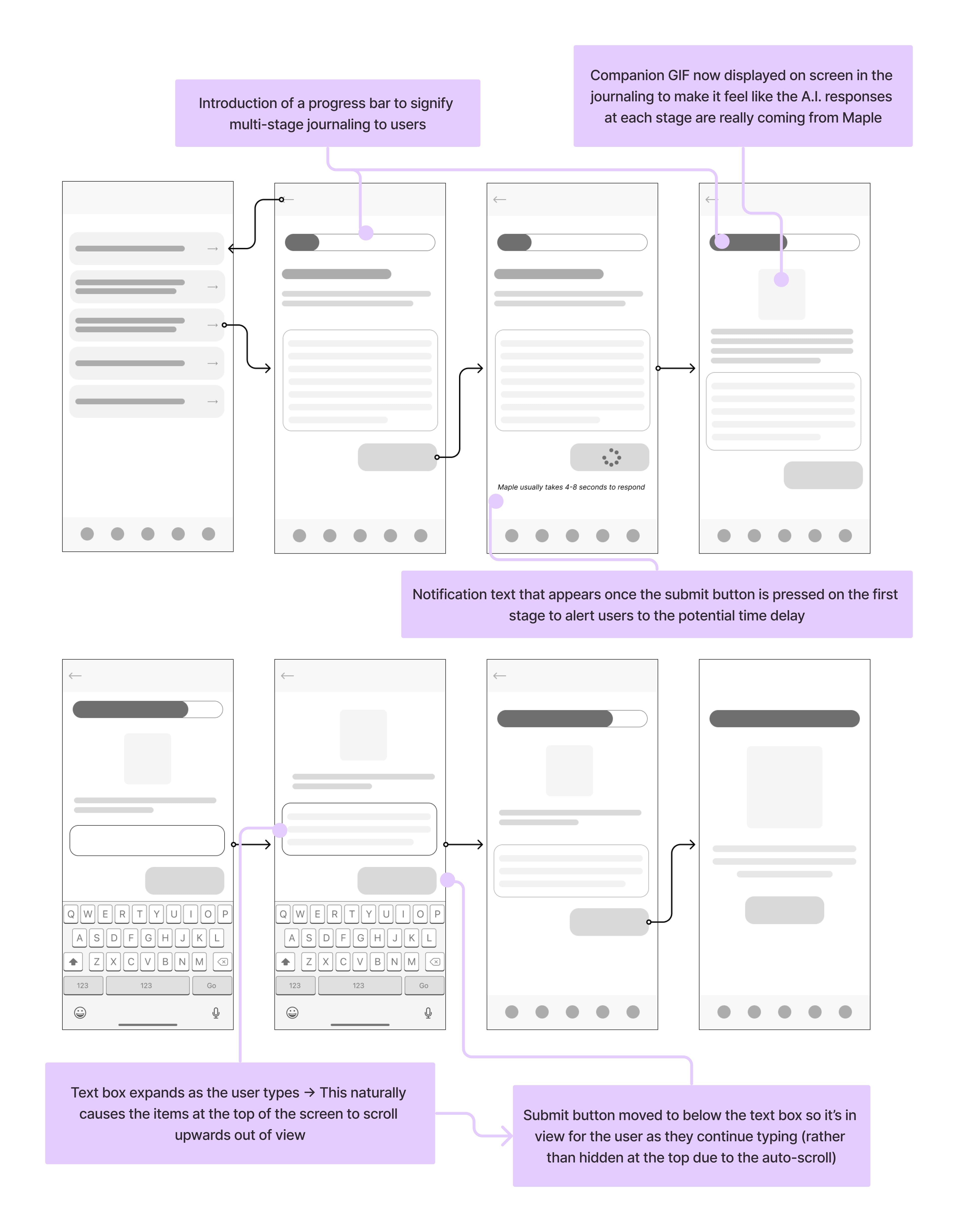
The MVP provided some valuable feedback on ways to improve the experience to help improve engagement and retention:
- Continued conversations
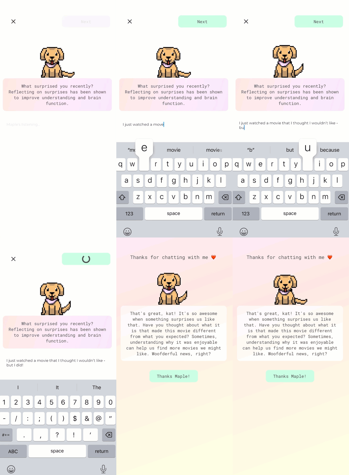
Based on user data, we discovered that users wanted to continue their conversations with the AI by starting a new prompt but continuing from a previous completed entry. We also observed that users were typing out longer entries, indicating a desire for deeper engagement. These insights led us to the idea of introducing a 3-part journaling format instead of a single page. This approach allows users to have a more fulfilling conversation with the AI while still maintaining a staged approach. We considered the findings from our earlier experiment, which indicated that users tended to disengage after 4-5 back-and-forths. By limiting the engagement to 3 parts, we aim to keep journaling exciting and engaging each time. - Improve accessibility
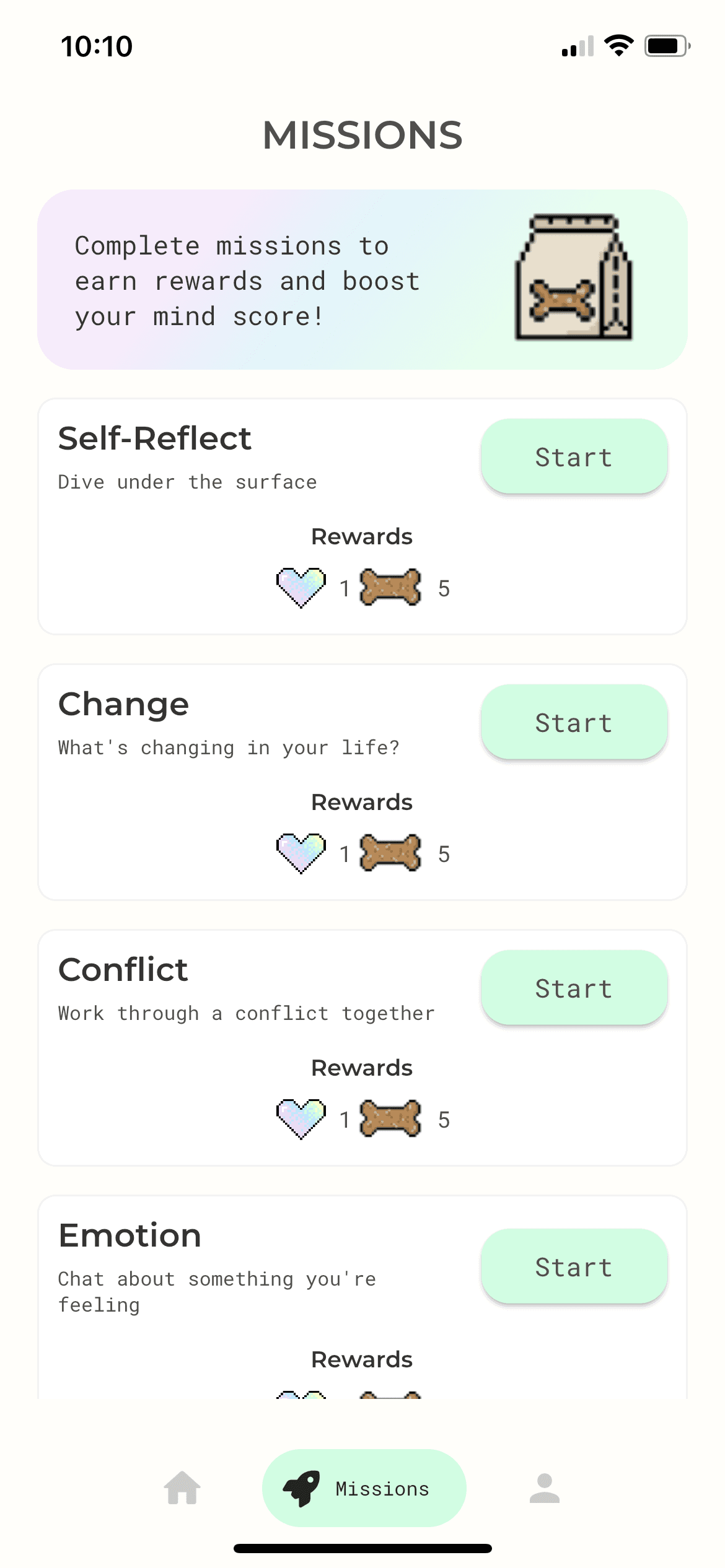
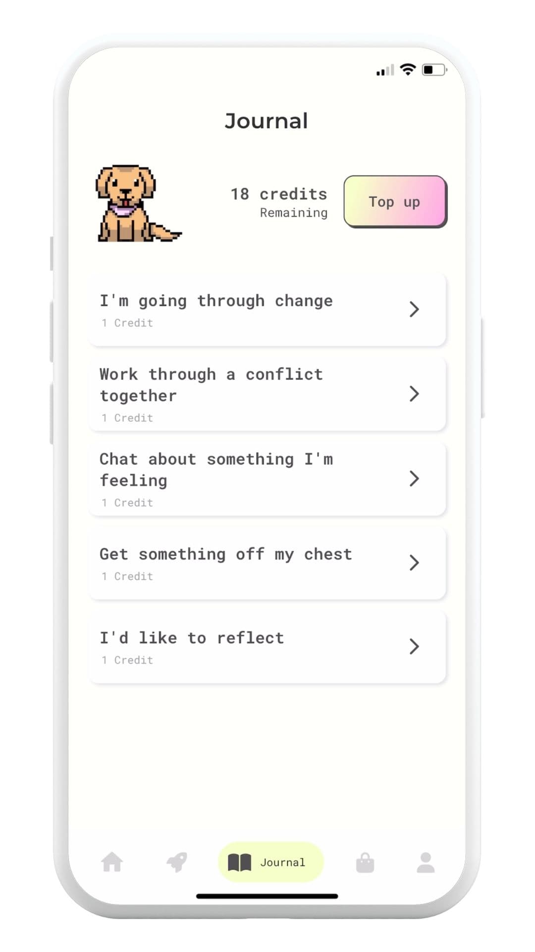
Supervised user acceptance testing highlighted difficulties in distinguishing buttons, text fields, and other elements within the app. To address this, I implemented stronger borders and adjusted colours to enhance accessibility. - Tweak journal prompts
Some users indicated that the single-word journal prompts were vague. To address this, we revised the prompts to use "I" statements that clearly convey what the user can expect from each prompt (e.g., "I want to reflect on something" instead of simply "Reflect"). - Increase visibility of system status
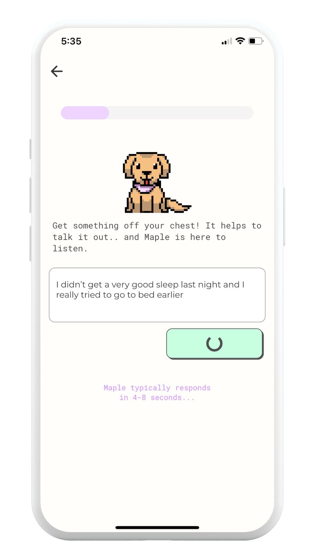
We saw that users were unintentionally pressing the Submit button multiple times, leading to duplicated API calls and responses. We added notification text upon pressing the button, informing users of the slight delay, and disabled the button after the first press to prevent multiple submissions. - Submit button location
Users were typing longer messages than anticipated, causing the text field to expand and push the UI at the top of the screen out of sight. To address this, I moved the submission button to the bottom of the text entry box, ensuring it remains visible to users immediately after they finish typing, eliminating the need for scrolling back up.
Fleshing these things out further resulted in the following wireframes:
The battle of the LLM's
During the process, a new release of ChatGPT occurred, which prompted us to assess whether we should switch our LLM or stick with the existing one, considering our focus on user experience.
We initially utilised ChatGPT 3 DaVinci, as it was the latest version that allowed for fine-tuning and incorporating our own datasets. However, ChatGPT 3.5 Turbo became available, promising better conversational prowess (without fine-tuning).
After conducting internal testing, we discovered that ChatGPT 3.5 Turbo generated more engaging and on-brand responses, exhibiting a conversational and personable tone. However, Turbo didn't strictly adhere to instructions during the final journaling stage, continuing the conversation indefinitely. On the other hand, DaVinci performed better in this aspect but was less effective in the earlier journaling stages, where we sought a more conversational approach with the ability to respond to multiple threads within a single response.
To strike a balance between conversational engagement and summarisation, we decided to implement a hybrid approach. We used ChatGPT 3.5 Turbo for the first two parts of the journaling process and ChatGPT 3 DaVinci for the final part, which required a concise and summarised conversation.
Understanding user sentiment
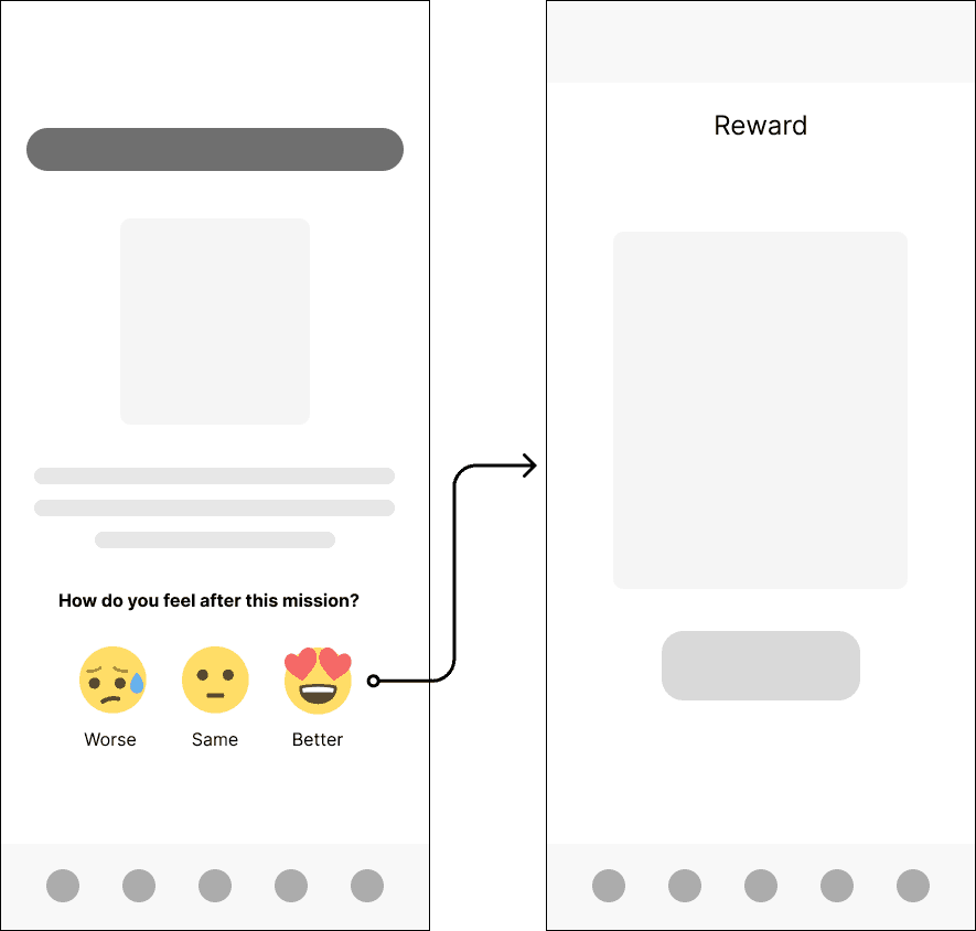
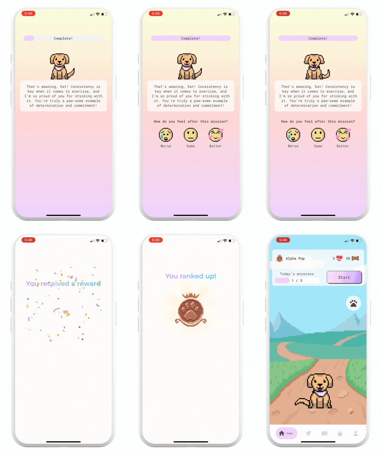
To gather feedback on user sentiment and evaluate the effectiveness of our journal prompts, we implemented a simple 3-point feedback scale. This allowed us to keep the feedback process easy to understand for the user, and remain fun, light-hearted and not feel like a chore following their journaling.
We made the decision to have the feedback options be represented as emojis — the Talk to Maple brand is fun and I wanted giving feedback to feel fun too. We also opted for a forced action, with the emoji selections becoming the only way to proceed to the rewards screen following their journal mission.
Through researching other feedback mechanisms, I saw that this was a common design pattern, but given the change in UI to a key screen, we were prepared to revert the change if we saw any significant drop in journal completions following the launch of the next release.
Deliver
Bringing it to life
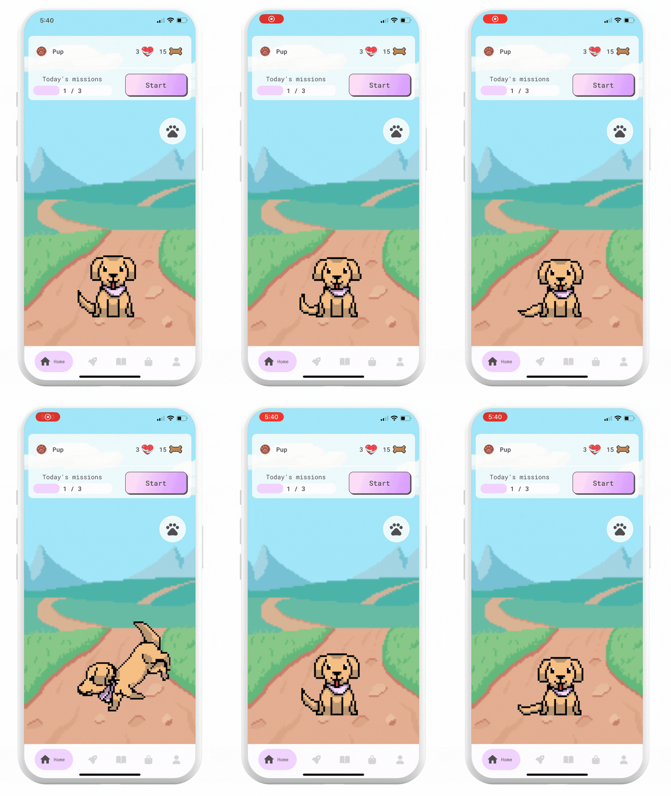
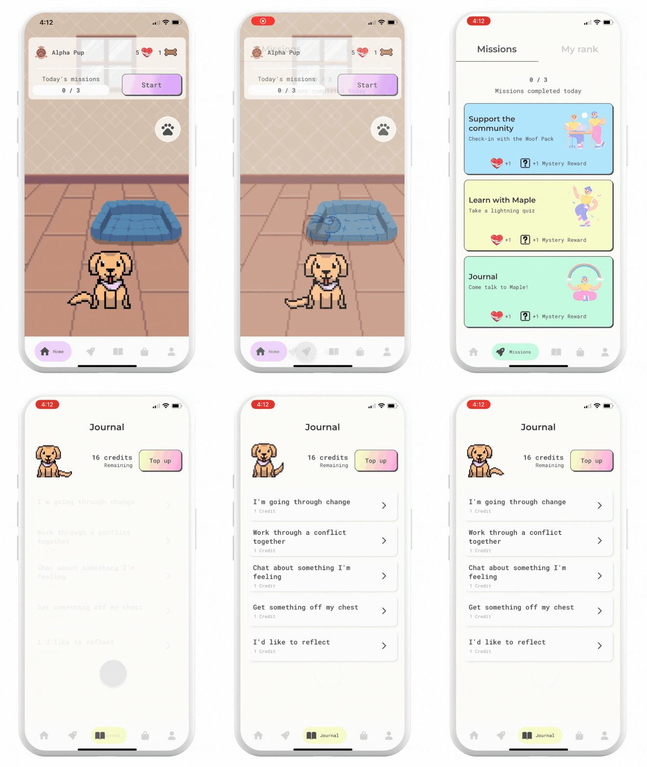
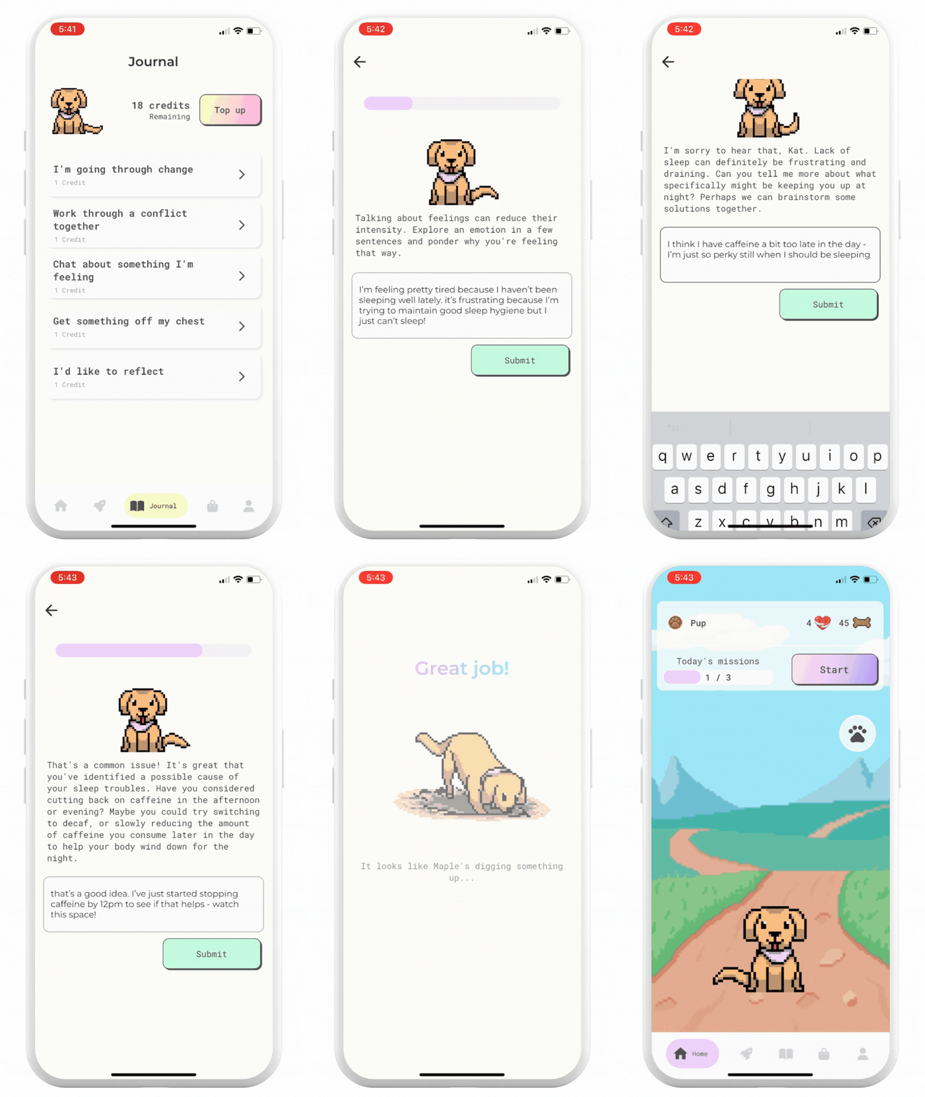
Learning from our MVP, and having gained proficiency in building apps in Flutterflow, we were able to build the next version of Talk to Maple at speed. This is the version we deployed to the app stores:
Outcome
Retention rate uplift
Following the new release of Talk to Maple, we saw a greatly improved Day 1 & Day 2 retention rate (characterised by completing a journaling mission), when compared to our MVP release:
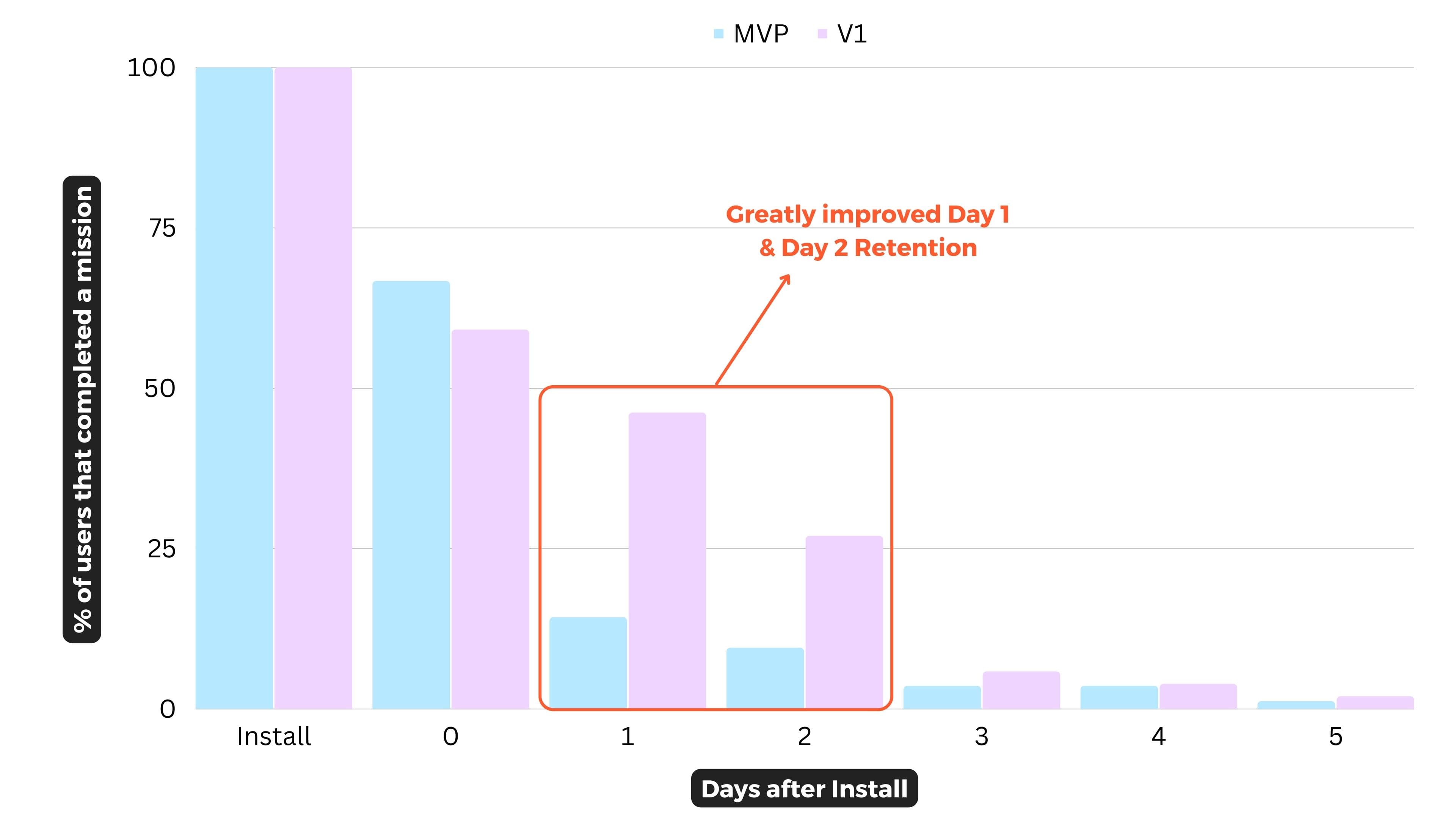
This is strong evidence that the combination of an improved journaling experience, UI and gamification really helped move the needle on user engagement.
Note: There is a slight dip in Day 0 retention for V1 versus the MVP. This can be attributed to changes made in the onboarding flow, in which the User was asked to do a full journal. This increased the speed they reached their 'Aha' moment, but also made it less likely to go to do an additional journal entry that same day.
User sentiment in the right direction
Our results of our basic user sentiment analysis also showed that95% of journal sessions resulted in the user feeling either the same or better, with 38% recording better. This is a great early indicator to show that Talk to Maple isn't doing harm and in fact on the right path to boosting our users mood. Although to be sure there is still further work to do in this space.
With the sentiment analysis being so simplified, it's difficult to understand if the high number of users reporting 'Same' is due to actually feeling the same, or if the other options of 'Better' or 'Worse' are too broad or ambiguous that they don't fit what the user is actually feeling. Widening this to include a broader range of emotions or switching the format up would help us get a better gauge on this stat.
Great user feedback
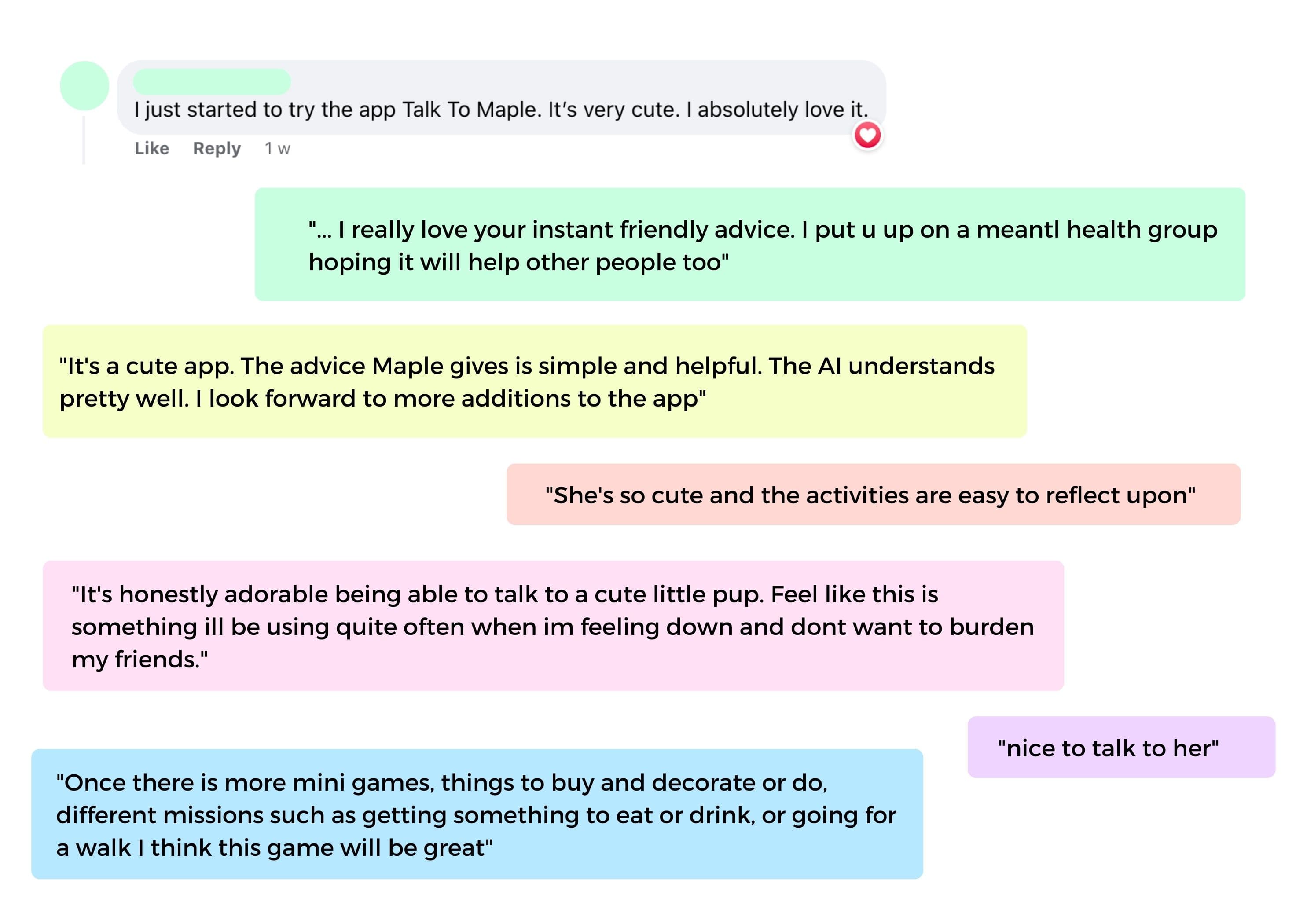
We had also included a short in-app feedback form for users to optionally complete, and we received some incredible feedback, reinforcing again that we were heading in the right direction:
What's next?
Whilst there have been positive early signals for Talk to Maple, there's definitely still a long way to go. Engagement and retention will continue to be the key focus metrics, which could be impacted through things such as:
- Push Notifications - to remind users to complete their daily missions or journal entries to further optimise retention from Day 3 onwards.
- More Content - through introducing things like more journal prompts, better rewards, further customisation and more interactions with the companion. Further gamification through things like leaderboards and friendly competition to drive extrinsic motivation are also things we'd be looking to explore in the future.
- Social Accountability - is a huge driver of habit formation; a great example is having a gym buddy. I hypothesise that introducing things like the ability to invite friends, send rewards to friends for completing a mission and supporting friends to stay accountable through in-app actions would help drive retention and engagement.
- Further user sentiment analysis - in particular, against each journal prompt and see if there's a correlation between how people feel after journaling and which prompt they've chosen. This can help inform what kinds of prompts might be good additions (or even which should be removed)
Reflections
As a team we had to opt out of the remainder of the program for personal reasons, however we will continue to work on Talk to Maple over time as a passion project.
The Antler program was incredibly intense and high pressure, and there were so many learnings that came out of it, but one of the big ones would have to be how invaluable having the right data is. As a team we were data geeks (with one co-founder even being a data scientist by trade), so we took the time to track as many key metrics as we could from the get go.
This definitely took a bit more time and effort, but turned out to be one of the best decisions we made. This helped not only build our credibility with the investment team but above all helped us make the the best decisions possible for our app and our users.
With such intense timelines we also had to prioritise our time; each day we focussed on the number one highest impact item we could be doing that takes us towards our goal of retained and engaged users. Having this clear north star helped us make trade-offs ruthlessly and move the needle as far as possible in the time we had. It did mean that other (also important) things got deprioritised in this early stage, such as marketing, acquisition etc.
